
Unruly Industries is a designer collectibles brand and a creative extension of Sideshow Collectibles.
I had the privilege to develop Unruly from the ground up with my director and input from the main stakeholders. The driving force behind Unruly was its unique departure from Sideshow’s high-end and realistic statuary and 1/6 scale posable figures the company is known for, and to offer a new line of artist-driven highly-stylized products with consumer-friendly price point. In creating Unruly, we also created an opportunity to work with an amazing and diverse group of independent artists, transforming their 2D works of art into 3D collectible figures to distribute all over the world.
Below you can see an overview of the brand, a selection of products from original creations to unique takes on licensed pop culture icons from Marvel, DC Comics, Star Wars and more. Visit the Collectibles page for further insight into specific products.


Making of the Brand
If you’ve made it this far, and would like to hear more about the thought process, and wheat paste behind it all, please read on…
Aesthetic Origins
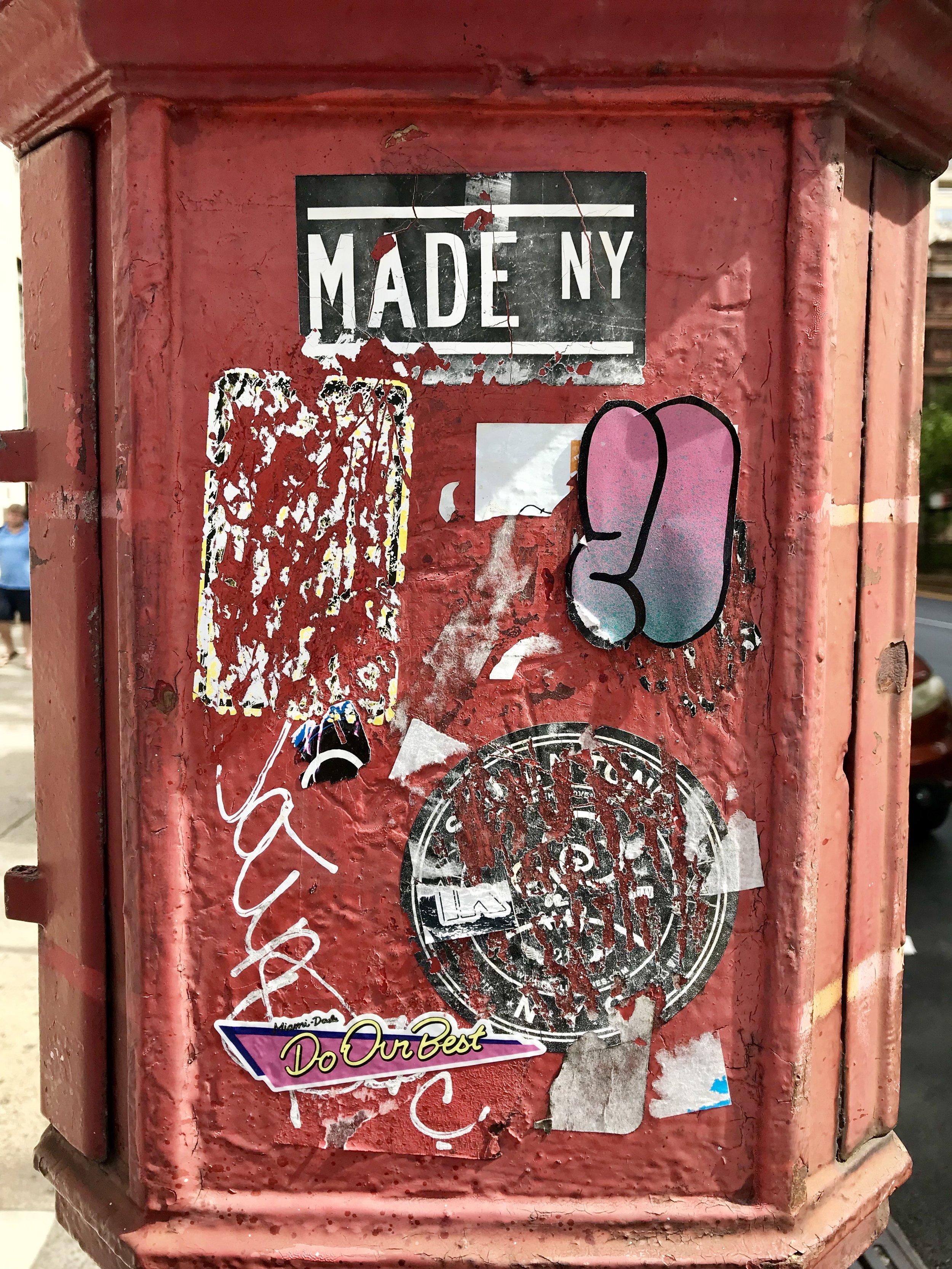
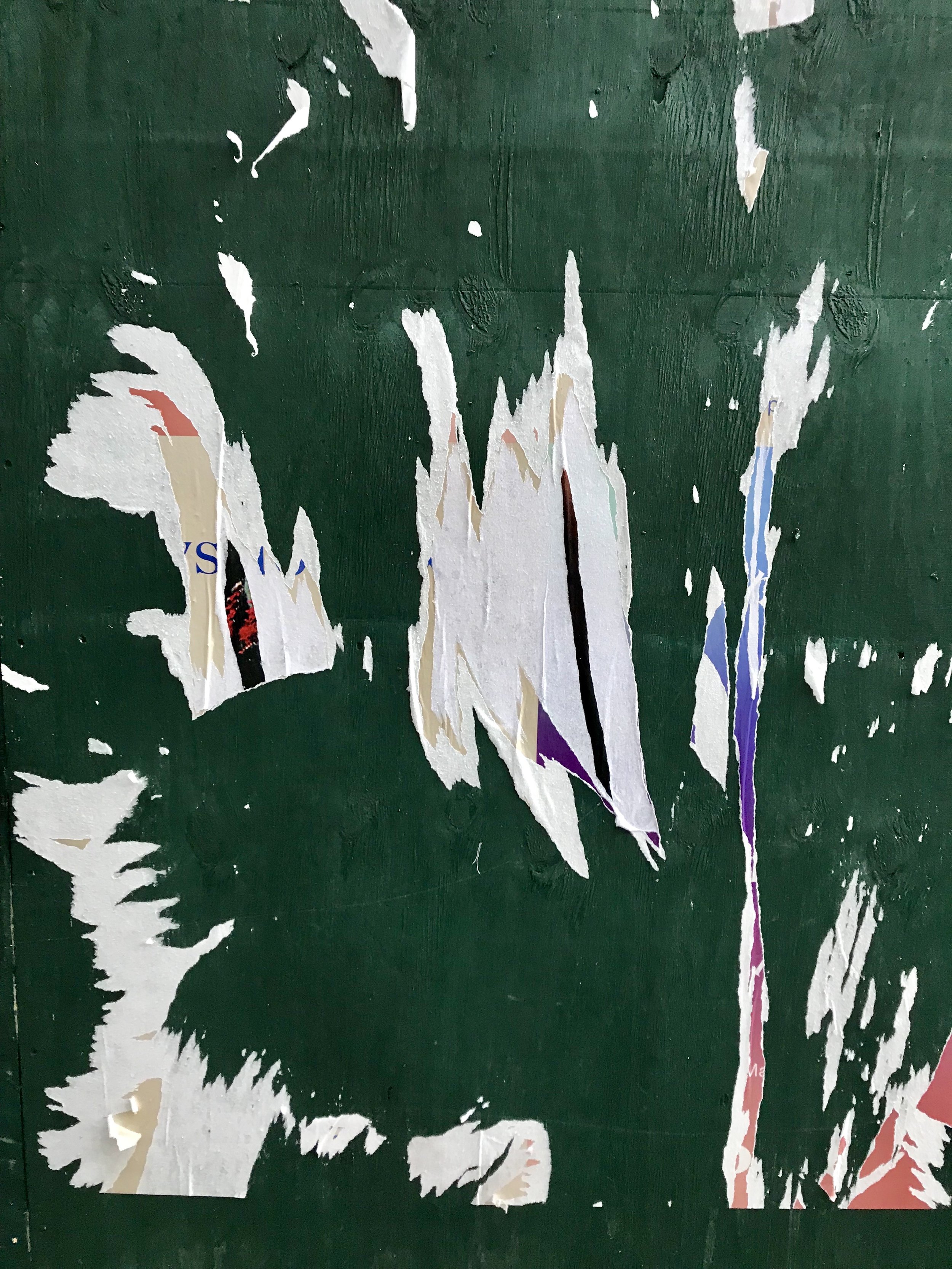
When this project was first being pitched, I was already booked on my first trip to New York. With the brand fresh on my mind it felt fortuitous to be immersed in the perfect setting for inspiration. I glommed onto the textures and colors of the streets. I’m certain I annoyed my partner on more than one occasion for making her stop so much to take a picture of a particularly weathered phone booth, or a series of graffiti-laden electrical boxes. I became particularly obsessed seeing the torn down layers of wheat pasted posters everywhere. I loved how they revealed fragments of what had come before and encapsulated the nature of art: It’s temporary and you have to be fearless in the way you approach it.


So with that experience, I brought back a whole bunch of inspiration and enthusiasm to the team. We had one night in particular I enjoyed taking extra prints of concept art and tearing them up to make a collage. It started just for fun, but the more we added to it, it began unify all the varied aesthetics together and that became a base layer for where the brand was headed.

For the main logo it felt appropriate to draw on the name of the brand and make it feel off-kilter and rule breaking. Drawing inspiration from duct tape lettering, the askew angles worked well for us as we tried to push away from the clean high-end look of the main Sideshow brand, and make this brand feel distinct.


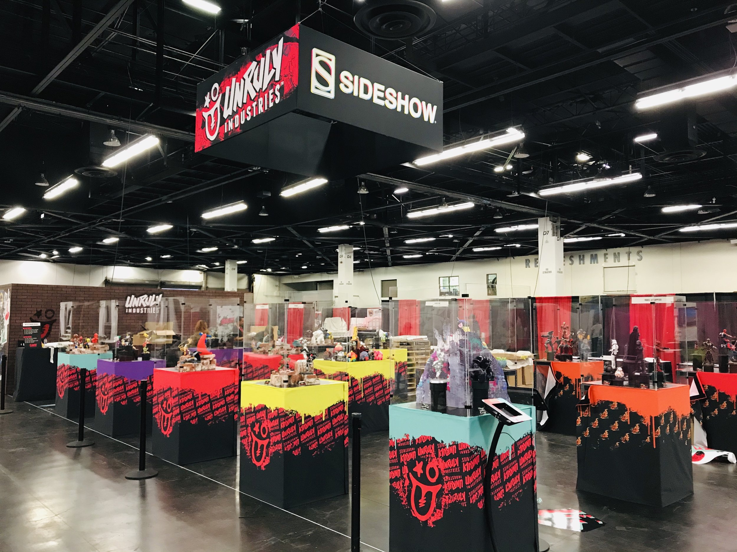
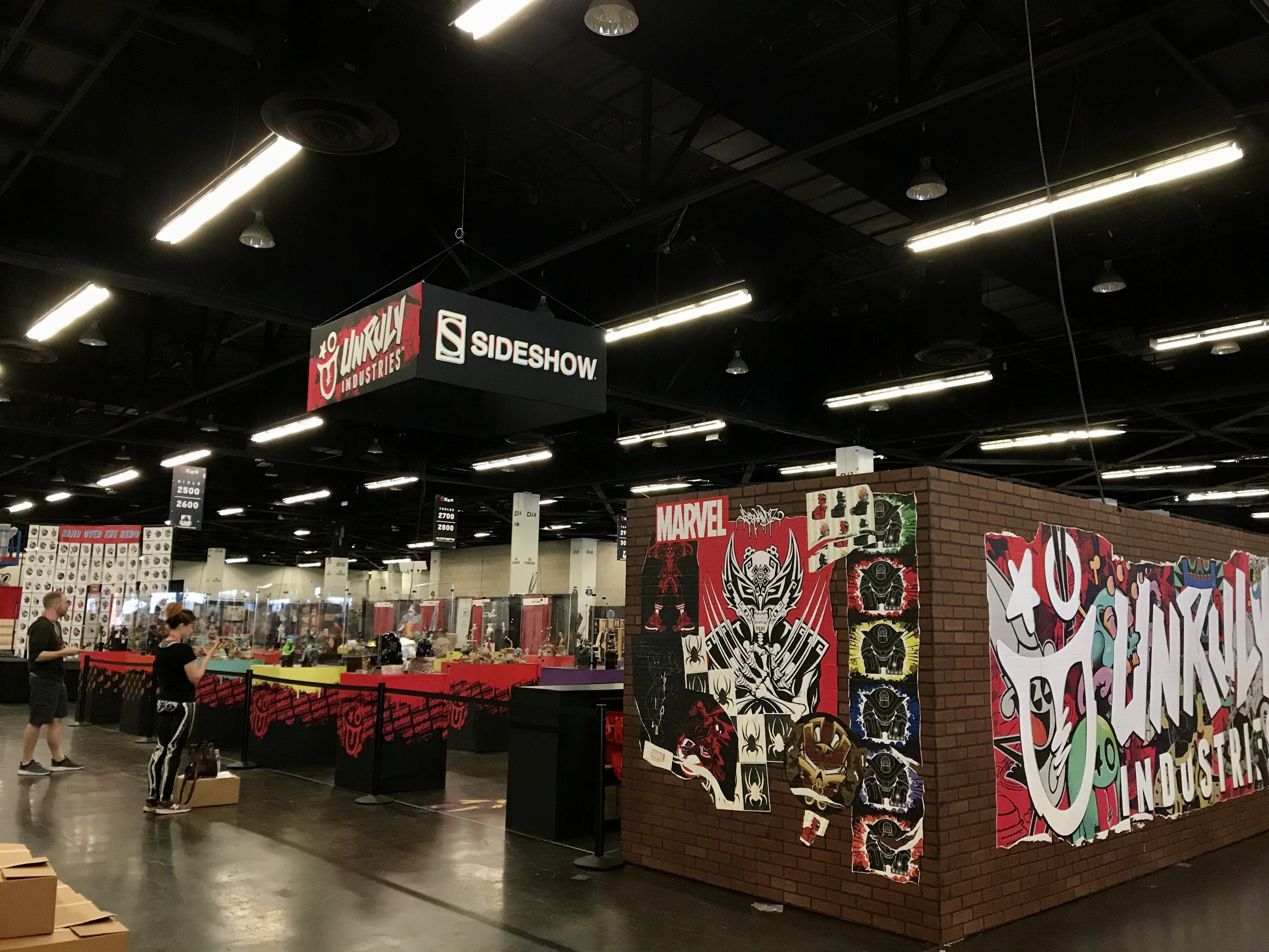
This combined aesthetic excitedly found it’s way onto our our convention booth - literally building a brick wall facade and wheat pasting up our graphics just like on the streets of the city. It provided a more interesting way to show off the new figures debuting at the shows, as well as being a great, messy team bonding experience.


The brand has grown and shifted over the years, but I am immensely proud of all the work, people, and experiences.
Doesn’t hurt to win the ‘Toy of the Year’ award along the way too!
